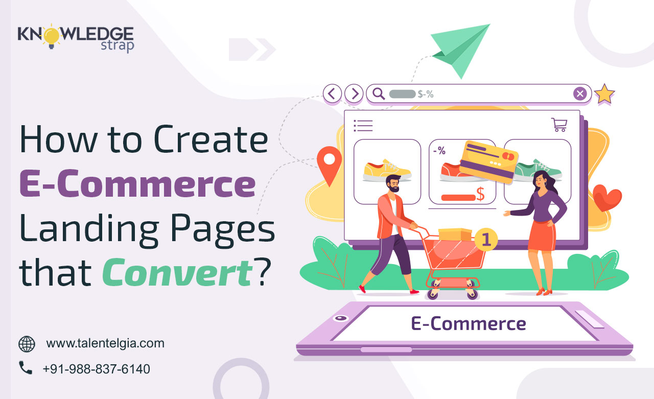
e-commerce sites are online stores built to sell products or services to people. In e-commerce app development, landing pages are a key success factor when designed appropriately.
High converting landing pages direct users to the products or services they want, thus increasing conversions and boosting ROI.
A landing page can be referred to as a web page on your website whose purpose is lead capture. A homepage or product page might serve the purpose of introducing your brand or building your brand identity. But a landing page will only focus on presenting your product to increase conversions.
Why Do You Need a Landing a Page?
Do you have a website with hundreds of products and eminent pages like home and product pages? Are you still deliberating if you need a landing page in your e-commerce app development process or not?
Well, imagine a visitor comes to your site looking for travelling bags. He is likely to land on your home page. If this shows several types of bags, this may confuse him and result in a failed lead.
Now imagine; he lands at a page that highlights the feature of your travel bag packs, offers a discount on the purchase and has a powerful CTA. This will lure them into grabbing onto the offer right away.
What Comprises a Good Landing Page?
The simpler the landing page; the more are the chances of conversion. So, while working with an e-commerce website development company for your brand, be mindful that it has clear information and offers little or no options to navigate away from it. The elements of high converting landing pages are:
Call to Action:
A CTA or a call to action is a button that does exactly what it is named; motivates the user to take action, mostly making a purchase.
However, you can also use them to collect data or get users to sign up for the newsletter. Further creating a CTA that grabs visitors’ attention will bring increased conversions!
White Space
You must de-clutter the landing page. This will keep the buyer away from any distractions and increase the chances of a sale which is why you will often see that there are no social media or navigation buttons on the high converting landing pages.
Heading
Perhaps the most important part, the heading should be clear and precisely describe the product and your brand.
Also, it should be easily visible in readable fonts and colours.
Text
You can briefly describe your product and provide relevant information in pointers along with relevant images.
Feel free to use icons and pointers that call for interest. At the same time, lengthy sentences and bulky paragraphs are a big no.
Images
Any webpage is incomplete without the use of relevant images to make it interactive. However, you can also use videos and icons so that consumers can understand more about your product.
Just be careful that these images do not compromise on quality and are relevant to the theme of your site.
Discount
Offering a considerable discount to the customers is a great way to lure them into purchasing.
But make sure that the discount is clear and legible. If it appears shady, it might do more harm than good.
Social proof
Showing your product reviews or google reviews is a great way to win people’s trust. Feel free to boost the big brands you are associated with so that people can believe you are a brand they can trust.
Once you build a landing page, never stop testing. It is open to AB testing, so experiment with all the elements until you get the one that does the magic for you!
Know your Sales Funnel
How you design a high converting landing page depends on its position in the sales funnel. So, depending on what you are aiming to achieve, you may opt for one of these strategies:
Awareness
These e-commerce landing pages are for the customers visiting your online store, possibly for the first time. So, introduce them to your brand. Share its story, values, and products to convert the leads at this phase.
Re-targeting
The mid-funnel level is for the customers who have shown interest but have not purchased anything yet. Build headlines for the products they have been eyeing or create a sense of urgency. You can use social proof to make them believe in your brand.
Upselling
It is for the users who have already visited your site and is known as the bottom-funnel level. These consumers have checked out your products. You can convert them by offering discounts, free shipping and bundled offers.
Engagement and retention
Focus on your favorite strata of customers, the loyal ones with this strategy. You do not have to show them your brand story or convince them. Simply retain them with exclusive deals, referral deals, loyalty points, real-time feedback, social media shoutouts and a lot more. Here, the CTA will focus on making the purchase and the user experience, making them an important element in e-commerce app development.
Does that look like a lot of information to digest? Well, it is not. A lot of brands have successfully used these to increase their ROI and so can you. Check out these examples.
Here are Five Landing Page that Have Aced the Basics
1. The Vegan Kind
The Vegan Kind perfectly fits into the definition of a perfect landing page. They have an attractive discount accompanied by a clear and intriguing CTA (Choose your box).
Further down the page, they have described how they work in three easy steps, each merely of a line or two.
A brief sneak peeks at their brand followed by the big brands they have worked with and the google reviews of the customer would leave little or no doubt in the mind of any potential buyer.
2. Airbnb
This landing page by Airbnb is another example of a successful landing page. It uses a high-quality, image with an easy-to-fill form.
As you scroll down, you will also find a brief description of the products and services. There are no social links, though the customers can choose from a variety of options.
The ample use of white space makes it informative yet clutter-free at the same time, showing us the perfect way to keep it clean yet provide all the required information.
3. Gwynniebee
Gwynniebee is an example of innovative e-commerce landing pages. Though they have used three different CTA’s here. Each of them prompts us to click and reveal our choice, thus initiating an interaction.
The terms are simplistically written at the bottom to ensure complete the information. Though, they have not used any additional links or images that can distract the potential buyer, using social proof here could be a huge plus.
4. Mr Draper
The e-commerce website development company for Mr Draper has done exceptionally well with its landing page. Relevant information, social proof, customer reviews; they have it all.
When you scroll, you will get an idea of how they work by reading a few lines. The text used is concise and straightforward. While perfect CTA demands action, it also increases the probability of sales.
5.Vanity Planet
So, if you too are connected with e-commerce app development**, don’t rethink your decision. Start building a landing page for your website now and watch your ROI skyrocket. Your future self will thank you for this and well, you can thank us later!**
Concluding Words
Having a superior quality landing page can get more conversions and contribute to your growth. So always make sure that all the elements like white space, text, font and social proof are appropriately used in it. Most importantly, set a clear intention whether you want to upsell, retarget or introduce your audience to a specific product/category. Looking for more information or experts that can help come up with intriguing pages to boost your conversions? Reach out to us